
What's Already in Your Backyard
A free ZIP lookup showing how many students around your school are already enrolled somewhere other than a public school — and how much that changes a few miles away.
As I keep experimenting with how AI can help with data analysis, I've been looking at what government data can tell enrollment directors about their own neighborhoods. So I built another tool. This one is about how families in different neighborhoods are deciding between public school and the alternatives.
That's a market question, and the Census has the answer. Type your ZIP code, and you'll see three numbers for the neighborhood around it: how many K–12 students are enrolled somewhere other than a public school, what share of all students that is, and how many are in public school. Then the same three numbers for every neighborhood near you.
The spread is the finding
Take San Diego County.
County-wide, 10.1% of K–12 students are enrolled outside public school. That single number is nearly useless for planning, because the county contains 22 distinct neighborhood areas, and they run from 5.4% to 23.7%.
One end of the county looks nothing like the other. A school positioned for the 5% neighborhood and a school positioned for the 24% neighborhood are in different markets, however similar the drive between them looks.
This is why the tool shows you every area near you rather than one number for your own. The headline figure is not the key point. The distance between the top of the list and the bottom is the part you can act on.
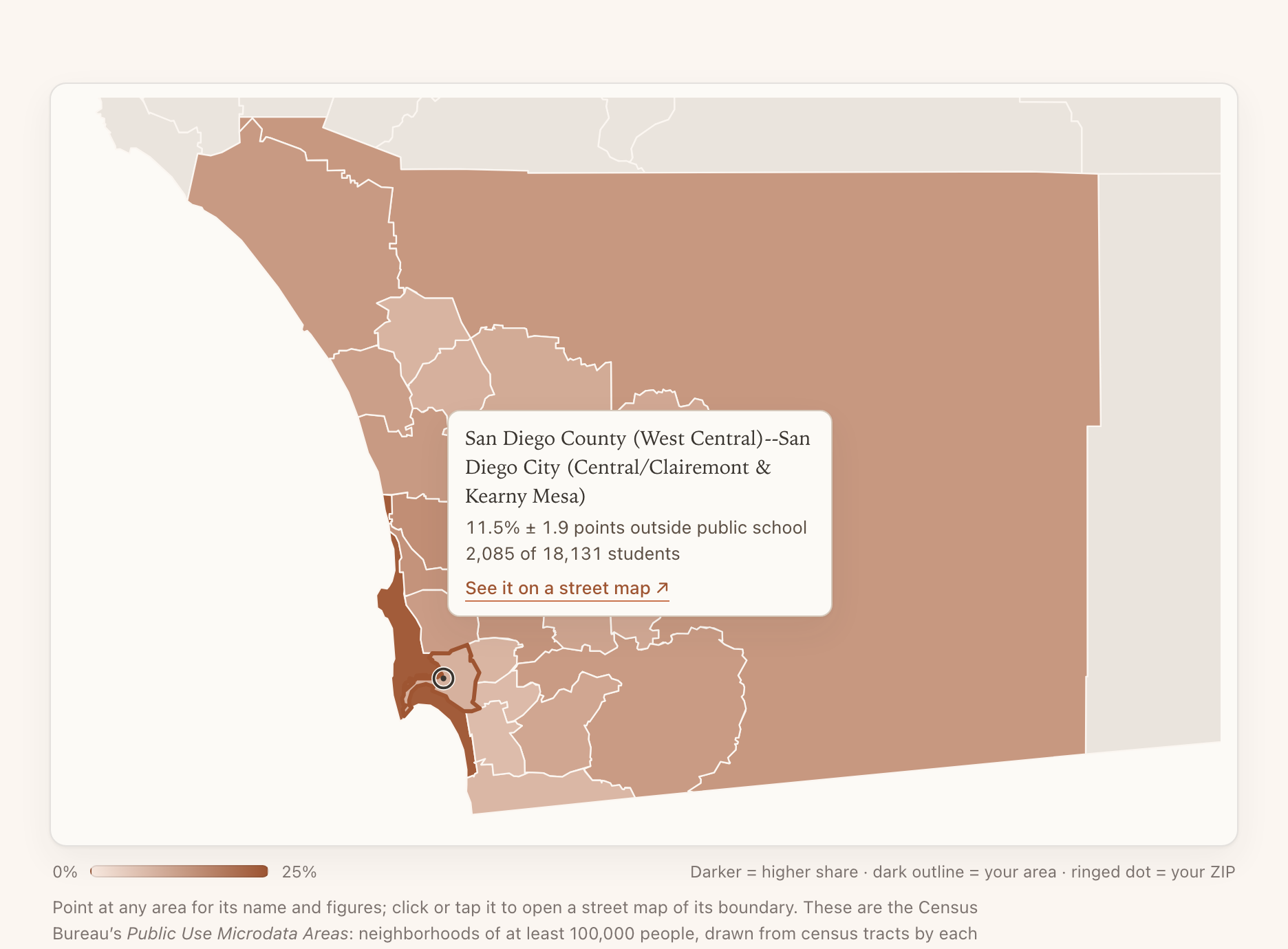
The map draws the same areas you see listed. Point at any one of them and it tells you the neighborhood's name, its share with the margin, and how many students sit behind it.
A door into the Census, if you want to go further
Those neighborhood areas have a formal name: Public Use Microdata Areas. Each holds at least 100,000 people and is built from whole census tracts, which is what makes the estimates steady enough to publish. The trouble is that no ordinary map shows them, so "San Diego County (West Central)" is hard to picture.
So each area on the map links out to Census Reporter, a free nonprofit project that makes Census data readable for people who don't work in it daily. Click an area and you'll land on its page, where its boundary is drawn on real streets, so you can finally see which neighborhoods you're looking at.
It's worth a few minutes beyond that. The same page carries a great deal more about that neighborhood — age, household composition, education, housing, how people get to work — all from the same survey. If a market ever surprises you in my tool, that's where I'd go to ask why.
What the number actually counts
The Census asks whether each enrolled person attends a public or a private school. The numerator here is students whose household chose the private box. The denominator is every student enrolled in K–12, public and private together — it's stated on the page beside the percentage, so the arithmetic is always visible.
There are three important things to know about these numbers:
Home school is in this number. The Census form puts private school and home school in a single checkbox. They cannot be separated at any geography, so the figure is "outside public school," not "in private school."
Charter schools count as public. In a market with many charters, more families have chosen a school other than their assigned one than this number shows.
"Private" is not "independent." It includes parochial schools and every tuition level.
Nationally the figure is 12.7%, and public schools educate the large majority of students in all but a handful of the 2,462 areas in the tool.
Every share on the page carries its margin of error, because these are survey estimates rather than head counts. That's also why the geography is what it is: at ZIP level the typical margin is ±9.9 points on a 9.6% median, which is noise the size of the number. At the neighborhood-area level it's ±1.8. You type a ZIP; the tool answers for the Census neighborhood area that ZIP sits in, and shows both areas when your ZIP straddles two of them.
It changes by grade, too
The result also breaks into three grade bands: K–4, grades 5–8, and grades 9–12.
In one San Diego area — East Central San Diego and La Mesa — 17.2% of K–4 students are outside public school, against 9.7% of high schoolers. That difference is larger than the margins on either, so it's real, and it's the kind of thing that tells you when your market's families make their move.
Where the three bands sit inside each other's margins, the tool says so plainly instead of inviting you to read a pattern into noise.
What to do with it Monday
Three questions to consider after looking up your neighborhood:
Which neighborhoods near us have the highest share, and how well do those families know our school? Sort is by share, highest first. Your own area is marked.
Are we assuming our market looks like our county? If your county has several areas, it probably doesn't.
Where do the grade bands shift? If the share is much higher in K–4 than in 9–12 near you, families in your market are deciding early.
The tool is free and there's no login. It runs on data already loaded into the page, with no AI at work behind it and nothing pulled from anyone else while you use it. Each lookup has its own link, so you can paste a neighborhood straight into a board deck or a colleague's inbox.
